React Native:Tutorial #4 – React Native UI Components
In this blog post, we will learn few commonly used React Native UI Components. We can use different types of UI elements in a react-native project. But remember that it may look different in an android and iPhone. We will learn how text inputs, touchables and picker with different examples.
If you have not read previous articles in this series, we request you to do so-
Tutorial Index
- Tutorial #1 – React Native – Introduction
- Tutorial #2 – React Native Props and State
- Tutorial #3 – Styling React Native App
- Tutorial #4 – React Native UI Components
- Tutorial #5 – React Native API Integration
- Tutorial #6 – React Native Animation
- Tutorial #7 – Top 10 React Native libraries
Text Inputs:
TextInput component is used to get user text inputs. Following are the props that can be used with text inputs : placeholder : This is the placeholder text i.e. the text that will be shown in an empty TextInput. value : Value to put in the TextInput onChangeText : It takes one function and that will be called on each text change . onSubmitEditing : It takes one function and that will be called once text is submitted.
Let’s take a look at the below example :
|
1 2 3 4 5 6 7 8 9 10 11 12 13 14 15 16 17 18 19 20 21 22 23 |
import React, { Component } from 'react'; import { Text, View, Button,TextInput } from 'react-native'; export default class MainComponent extends Component { constructor(props) { super(props); this.state = {text: ''}; } render() { return ( <View style={{paddingTop: 100, paddingLeft : 100}}> <TextInput style={{height: 40}} placeholder="Enter a text" onChangeText={(text) => this.setState({text})} value={this.state.text} /> <Text style={{padding: 10, fontSize: 42}}> {this.state.text} </Text> </View> ); } } |
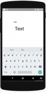
If you type any text in the TextInput, it will show the same text below in a Text. ‘placeholder’ props is used to put the placeholder. This is removed once user starts to type. The onChangeText props takes one function and it change the value of ‘text’ in the current ‘state’. ‘value’ props is used to put the text in the TextInput. We are not directly changing the ‘value’ of the ‘TextInput’. It changes the value of ‘text’ in the ‘state’ and that ‘text’ is assigned as the value. The bottom ‘Text’ is used to put the same text that the user is typing.
TextInput has a lot of other props for customization. You can check this official guide to learn more about it.
Touch Handling:
All mobile applications are handled mainly using finger touch. These touch gestures can be of different types like tap, swipe, pinch etc. React native provides one gesture responder system to handle different gestures. Almost all react native component can detect user finger tap, but one component that is only for deal with touch event is called ‘Touchables’. Using this component, we can create our own custom buttons with different design. It also provides two different props to detect single press and long press events. Following are the types of feedbacks it can provide :
TouchableHighlight :
This can be used with a button or web-link. The view will be darkened when the user presses down the element.
TouchableNativeFeedback :
This will show ripple effect on Android. TouchableNativeFeedback is not supported on iOS.
TouchableOpacity :
This will reduce the opacity of the button when user presses down.
TouchableWithoutFeedback :
Use it if you don’t want to show any feedback to the user on tap.
Apart from these types, we can use ‘onPress’ and ‘onLongPress’ props to detect single press and long press. Both of these props takes one ‘function’.
|
1 2 3 4 5 6 7 8 9 10 11 12 13 14 15 16 17 18 19 20 21 22 23 24 25 26 27 28 29 30 31 32 33 34 35 |
import React, { Component } from 'react'; import { Text, View, Button,TextInput,TouchableHighlight, StyleSheet } from 'react-native'; export default class MainComponent extends Component { onButtonPressed() { alert('Button pressed!') } onButtonLongPressed() { alert('Button Long pressed!') } render() { return ( <View style={{paddingTop: 100, alignItems: 'center'}}> <TouchableHighlight onPress={this.onButtonPressed} onLongPress={this.onButtonLongPressed}> <View style={styles.button}> <Text style={styles.buttonText}>Touch it</Text> </View> </TouchableHighlight> </View> ); } } const styles = StyleSheet.create({ button: { width: 260, height: 50, alignItems: 'center', justifyContent: 'center', backgroundColor: 'blue', borderRadius: 5 }, buttonText: { color : "white" } }); |

As you can see here, we are using ‘onPress’ and ‘onLongPress’ props to detect single press and long press in the TouchableHighlight component.
Picker:
Picker is used to ask user to pick from a list of values. Picker component is available in both Android and iOS. The functionality is same in both Android and iOS but the look is different. Actually it uses the native Android and iOS pickers and both looks different. It shows the selected value and once we click on it, it shows a list of available values in a popup in android. In iOS, it shows one scrollable wheel with all the options available. We can import the Picker component from ‘react-native’ as like other components. For example :
|
1 2 3 4 5 6 7 8 9 10 11 12 13 14 15 16 17 18 19 20 21 22 23 24 25 26 27 |
import React, { Component } from 'react'; import { View, Text, Picker, StyleSheet } from 'react-native' class MainComponent extends Component { state = {day: ''} changePickerValue = (d) => { this.setState({ day: d }) alert(`selected ${d}`) } render() { return ( <View style={{paddingTop: 100}}> <Picker selectedValue = {this.state.day} onValueChange={(value, index) => this.changePickerValue(value) }> <Picker.Item label = "Sun" value = "Sun" /> <Picker.Item label = "Mon" value = "Mon" /> <Picker.Item label = "Tues" value = "Tues" /> <Picker.Item label = "Wed" value = "Wed" /> <Picker.Item label = "Thurs" value = "Thurs" /> <Picker.Item label = "Fri" value = "Fri" /> <Picker.Item label = "Sat" value = "Sat" /> </Picker> </View> ) } } export default MainComponent |
If you run this code, it will look like as below on an Android phone : 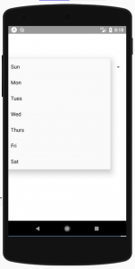
We need to add a list of items as ‘Picker.Item’ inside the ‘Picker’ component that will be shown in the picker list. Picker has a lot of different props. Few of them are as below :
1. onValueChange :
It gives one callback when one item is selected from the picker. It gives the value of the selected item and the index of that item. Index is important, we can pick from a different mapping list using the index if required.
2. selectedValue :
Selected value that should be matched with one of the list of picker item values.
3. enabled :
It will disable the picker if we set the value to ‘false’.
4. mode :
This option is available only for Android. It can be either ‘dialog’ or ‘dropdown’. ‘dialog’ shows a modal dialog, this is the default option. ‘dropdown’ shows a dropdown view.
5. style and itemstyle :
style should be of type ‘pickerStyleType’. It is used to add one ‘style’ to the ‘picker’. ‘itemStyle’ is used to apply style to each of the item labels.
Conclusion
So far we have seen most commonly used React Native UI Components that are required by most apps. Please let us know your views, questions about the same.
Tutorial Index
- Tutorial #1 – React Native – Introduction
- Tutorial #2 – React Native Props and State
- Tutorial #3 – Styling React Native App
- Tutorial #4 – React Native UI Components
- Tutorial #5 – React Native API Integration
- Tutorial #6 – React Native Animation
- Tutorial #7 – Top 10 React Native libraries
