React Native:Tutorial #3 – Styling React Native App
Styling is one of the important part of application development. For native android development, XML is used to design the UI. Similarly, for native iOS development, XCode is required. But in React Native, we use only JavaScript to style the application that runs on both Android and iOS. For specifying the layout of UI components in react-native, flexbox is used. In this tutorial, we will learn how to add style and how to use flexbox in React Native.
If you have not read through earlier concepts, please start here
Style :
In react-native, we can’t use CSS for styling. Instead, JavaScript is used to add style elements. Each UI elements takes one style ‘props’ that is applied to it. Unlike CSS, the naming convention uses camel case, e.g. for adding a background color of an element, we will use ‘backgroundColor’ instead of ‘background-color’ .
For example, we can create one bold text like below :
<Text style={{fontWeight: 'bold'}}>Hello</Text>
Each component takes different types of style props. If we pass any invalid style props, it will be ignored.
Using Stylesheet :
Adding style props for each UI component will make the code unorganized and messy. Also, with this way, we can’t share style with more than one UI elements. React-native provides another way to create one common style pattern that can be shared among different UI elements. To create a common stylesheet, use StyleSheet.create method as showing below :
|
1 2 3 4 5 6 7 8 9 10 11 12 13 14 15 16 17 18 19 20 21 22 |
import React, { Component } from 'react'; import { StyleSheet, Text, View, Button } from 'react-native'; const styles = StyleSheet.create({ title: { color: 'blue', fontWeight: 'bold', fontSize: 30, }, description: { color:"#841584" }, }); export default class StyleClass extends Component { render() { return ( <View> <Text style={styles.title}>This is a heading</Text> <Text style={styles.description}>This is a description with different style.</Text> </View> ); } } |
In this example, we have one component called ‘StyleClass’ with two ‘Text’ elements. Both ‘Text’ elements are using two different styles. We are defining the style before exporting the component using ‘StyleSheet.create’. You can see that two different styles are created : ‘title’ and ‘description’ and for adding these styles we are using ‘{styles.stylename}’. The main advantage of this approach is that the code becomes cleaner and we can use one style in more than one UI components.
Adding height and width for fixed dimension :
In react-native, we can add fixed width and height for an UI element. If we set fixed height/width, they will be rendered in the same size for all sized devices. You can use ‘width’ and ‘height’ in the ‘style’ like below :
<View style={{width: 150, height: 150, backgroundColor: 'powderblue'}} />
These sizes are unitless and represents density independent pixels.
But this is not a good practice because if we want a view or any other UI element to fill half of the screen, and if we use fixed dimension, it will be different on different devices like phones and tablets. For that, another mechanism is used called ‘flexbox’. Let’s check how it works :
Flexbox :
Flex is used to give dynamic size to a view. If you give flex value 1, it will take the full screen space. We can give the parent view as ‘flex = 1’ and give different flex values to its child views. For example,
|
1 2 3 4 5 6 7 |
<View style={{flex: 1}}> <View style={{flex: 0.2, backgroundColor: 'red'}} /> <View style={{flex: 0.2, backgroundColor: 'blue'}} /> <View style={{flex: 0.2, backgroundColor: 'black'}} /> <View style={{flex: 0.2, backgroundColor: 'orange'}} /> <View style={{flex: 0.2, backgroundColor: 'green'}} /> </View> |
Here, the output will look like below : 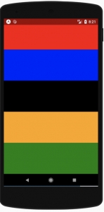
As you can see that the inner views are equally divided. If we give different value to the inner views, with a same value, it will produce the same output. Larger flex value will allot higher space ratio as compared to its siblings. Note that a view must have flex of value greater than 0 or it must have any fixed height/width, else the child views will not be visible. Flexbox is used to provide consistent layout size on different screens.
Following are the main concepts of Flexbox :
- flexDirection
- alignItems
- justifyContent
flexDirection :
flexDirection is used to define in which direction child views are placed. Following are the main flexDirection types :
row : Align all items from left to right. column : Align all items from top to bottom. This is the default value. row-reverse : Opposite or row. Align all items from right to left column-reverse : Opposite of column. Align all items from bottom to top.
For example :
|
1 2 3 4 5 6 7 8 9 10 11 12 13 14 15 |
import React, { Component } from 'react'; import { Text, View, Button } from 'react-native'; export default class MainComponent extends Component { render() { return ( <View style={{flexDirection: "row",flex : 1}}> <View style={{flex: 2, backgroundColor: 'red'}} /> <View style={{flex: 2, backgroundColor: 'blue'}} /> <View style={{flex: 2, backgroundColor: 'black'}} /> <View style={{flex: 2, backgroundColor: 'orange'}} /> <View style={{flex: 2, backgroundColor: 'green'}} /> </View> ); } } |
It will produce the below output : 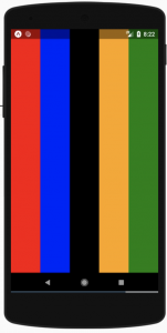
justifyContent :
During development you can use this to describe how child views in its axis are aligned. Following are its main types : flex-start : This is the default value. It will align all contents to the start of the main axis. flex-end : Align contents to the end of the axis. center : Align contents to the center of the axis. space-between : evenly space all children across the axis, distributing remaining space between the children. space-around : Evenly space children, distributing remaining space around the children.
For example :
|
1 2 3 4 5 6 7 8 9 10 11 12 13 |
import React, { Component } from 'react'; import { Text, View, Button } from 'react-native'; export default class MainComponent extends Component { render() { return ( <View style={{flexDirection: "column",flex : 1,justifyContent: 'space-between'}}> <View style={{flex: .2, backgroundColor: 'red'}} /> <View style={{flex: .2, backgroundColor: 'blue'}} /> <View style={{flex: .2, backgroundColor: 'green'}} /> </View> ); } } |
It will produce the below output : 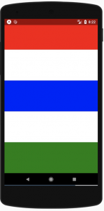
alignItems :
This is used to align items along the cross axis. One can use justifyContent to align the main axis. alignItems align items along the cross axis. Following are its types : stretch : stretch child to match the height of the cross axis. flex-start : Align children to the start of the cross axis. flex-end : Same as above, but it align to the ends. center : Align to the center. baseline : Align along a common baseline.
For example :
|
1 2 3 4 5 6 7 8 9 10 11 12 13 |
import React, { Component } from 'react'; import { Text, View, Button } from 'react-native'; export default class MainComponent extends Component { render() { return ( <View style={{flexDirection: "column",flex : 1,justifyContent: 'center', alignItems: 'center'}}> <View style={{width: 50, height: 50, backgroundColor: 'red'}} /> <View style={{width: 50, height: 50, backgroundColor: 'blue'}} /> <View style={{width: 50, height: 50, backgroundColor: 'green'}} /> </View> ); } } |
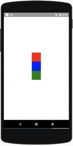
You can also use ‘alignSelf’ property to override alignItems for a single item.
flexWrap alignContent :
If the size of the screen overflows, you can use flexWrap to control elements . It has two values ‘nowrap’ and ‘wrap’. For example :
|
1 2 3 4 5 6 7 8 9 10 11 12 13 |
import React, { Component } from 'react'; import { Text, View, Button } from 'react-native'; export default class MainComponent extends Component { render() { return ( <View style={{flexDirection: "column",flexWrap: "wrap",flex : 1}}> <View style={{width: 50, height: 250, backgroundColor: 'red'}} /> <View style={{width: 50, height: 250, backgroundColor: 'blue'}} /> <View style={{width: 50, height: 350, backgroundColor: 'green'}} /> </View> ); } } |
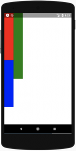
As you can see here, the last view is placed on right as it will cross the screen if we place it below the second view.
You can use alignContent to align the items if you wrapped them using ‘flexWrap’. It has 6 values : ‘flex-start’, ‘flex-end’, ‘stretch’, ‘center’, ‘space-between’, ‘space-around’.
Flexbox concept is same as in CSS. The only difference is that flexDirection is ‘column’ by default and flex parameters only supports a single number.
Conclusion:
The article has taken you through brief introduction on how you can perform Styling on React Native App. Please read through and let us know if you need us to update the article to include any points.
Tutorial Index
- Tutorial #1 – React Native – Introduction
- Tutorial #2 – React Native Props and State
- Tutorial #3 – Styling React Native App
- Tutorial #4 – React Native UI Components
- Tutorial #5 – React Native API Integration
- Tutorial #6 – React Native Animation
- Tutorial #7 – Top 10 React Native libraries